Event Player Design Refresh
The webcast player has been updated to include additional spacing and refreshed styling. This design update is very subtle and will seamlessly integrate with your past and present events, ensuring a smooth transition.
New Modern Player Design
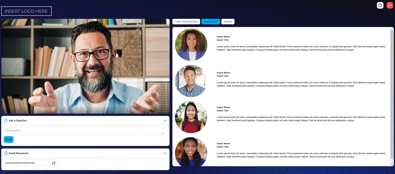
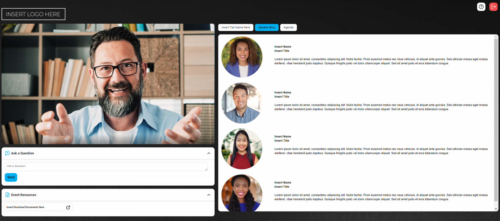
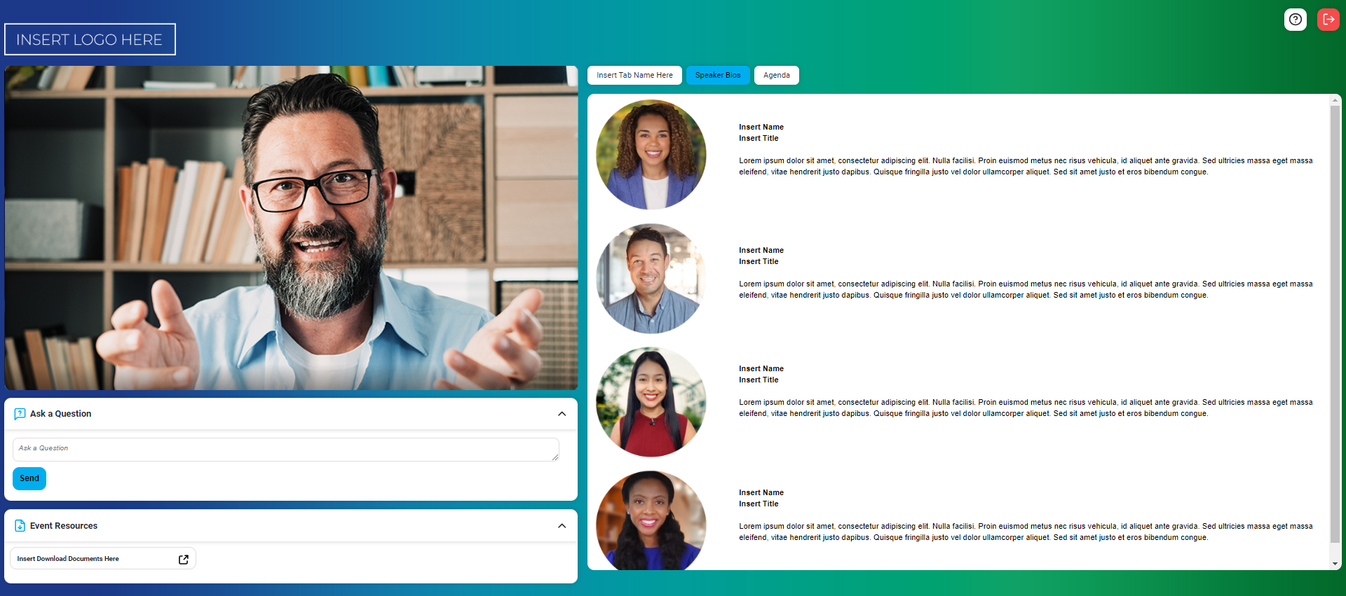
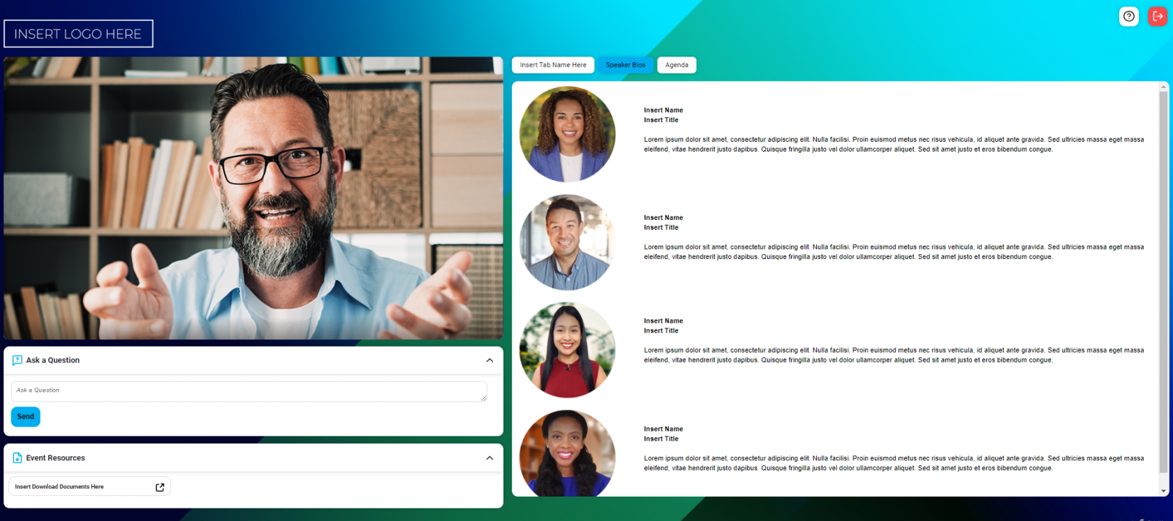
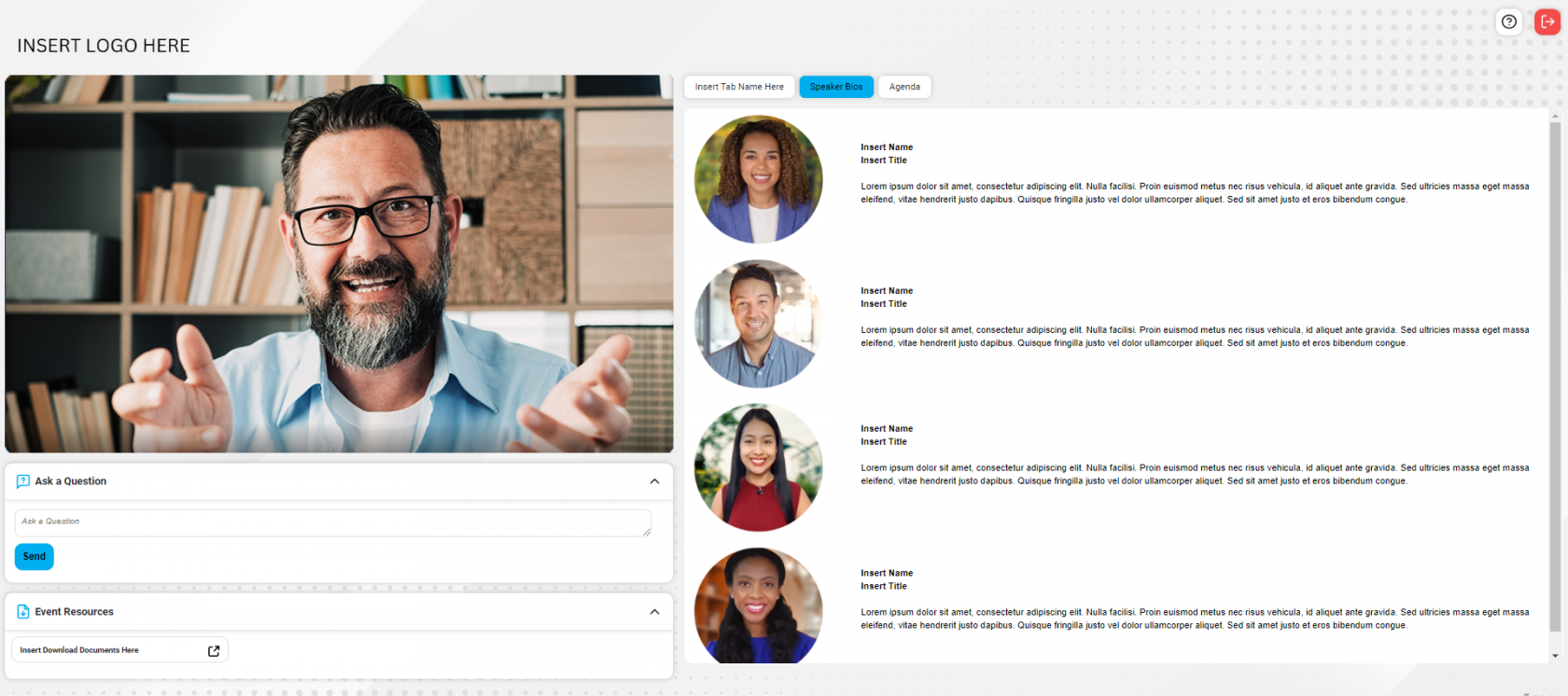
We're also introducing a curved and more stylized player design. This exciting update will be available to all customers as part of a phased rollout providing a modern and more impactful look and feel for your events. Please contact your account representative to opt in and level up your player design, for no additional charge.
Optimizing your branding
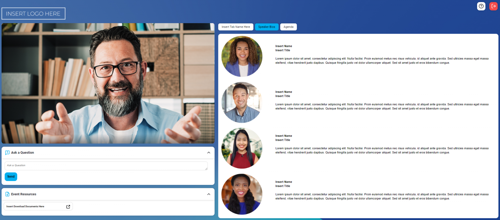
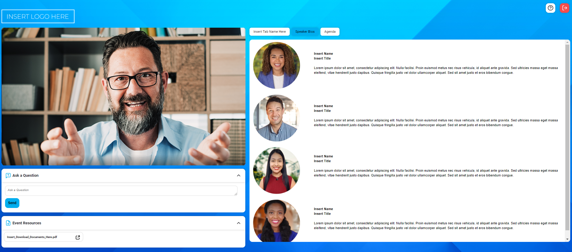
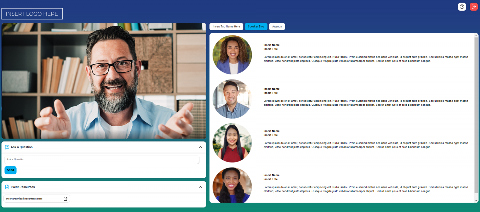
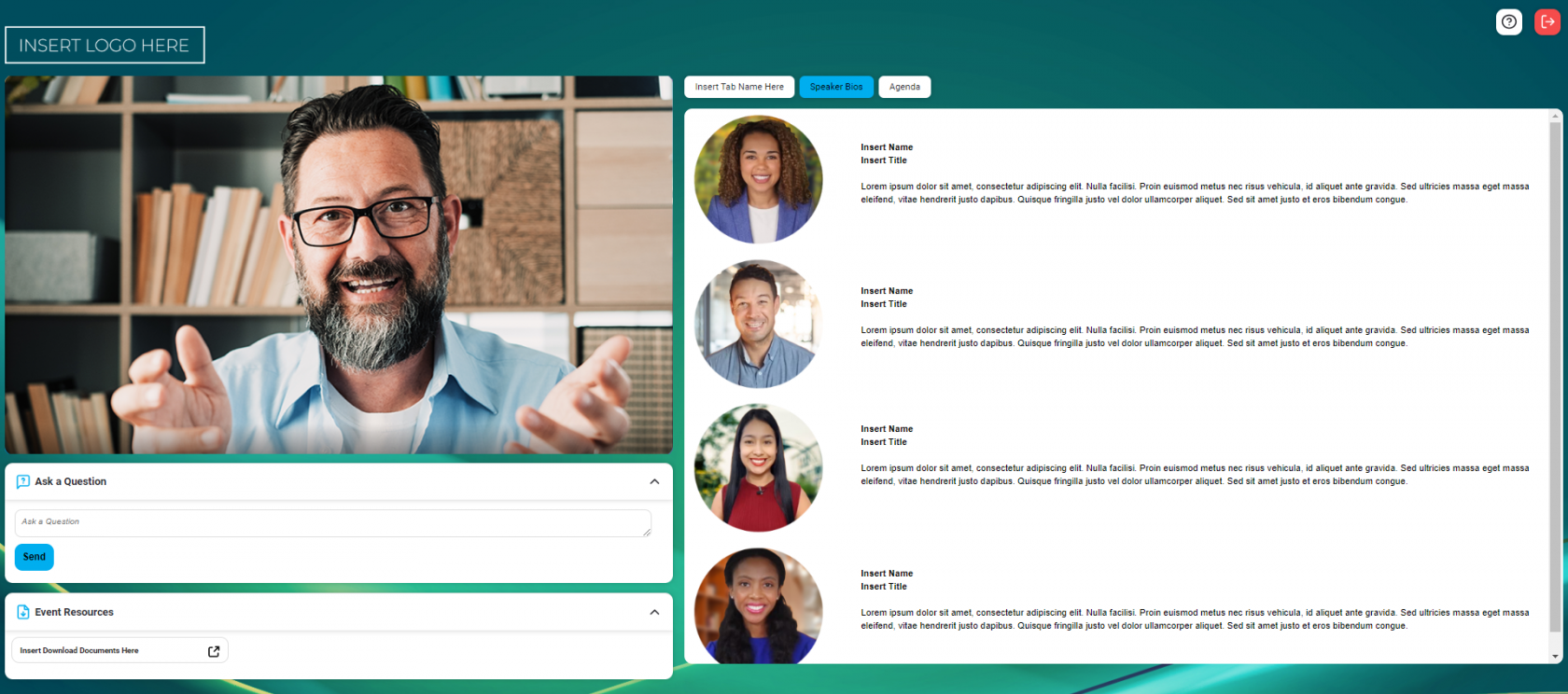
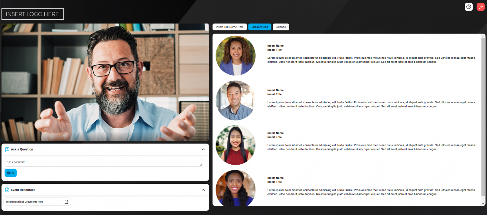
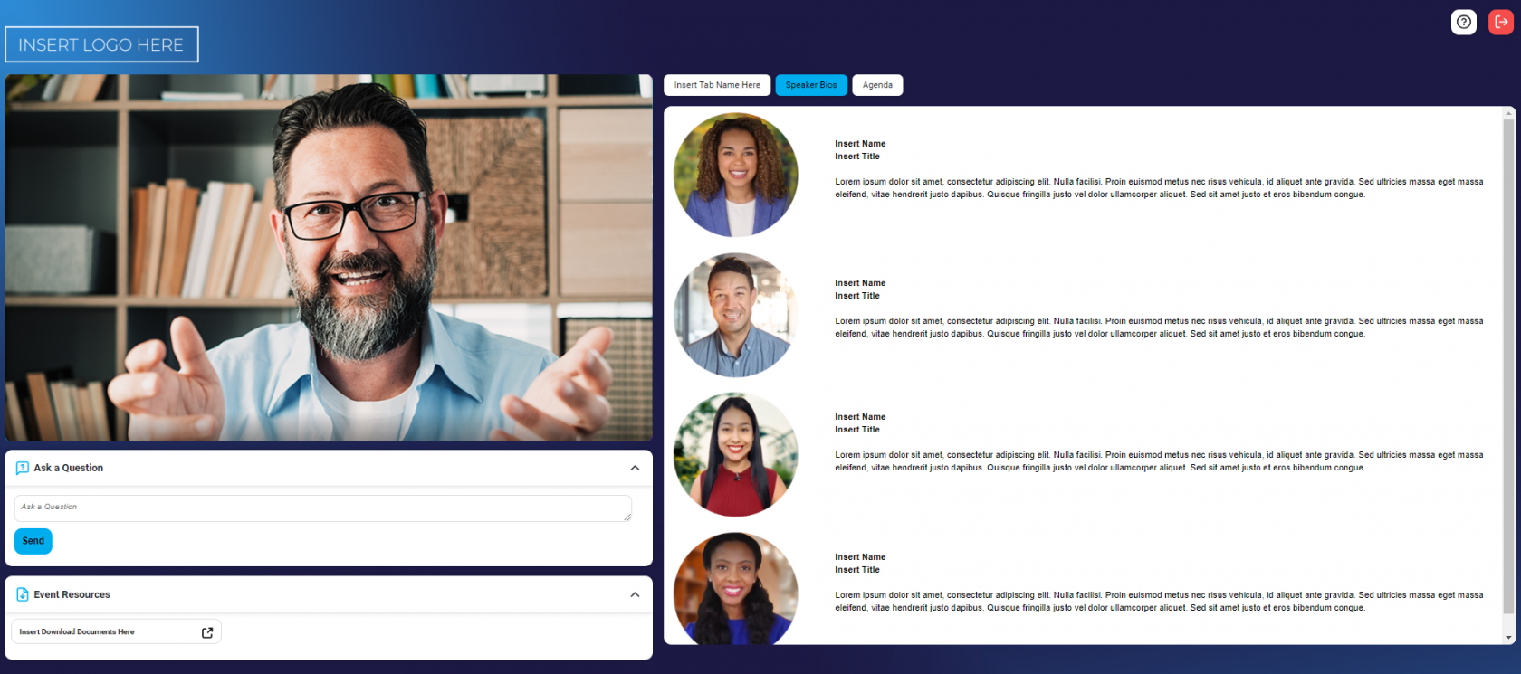
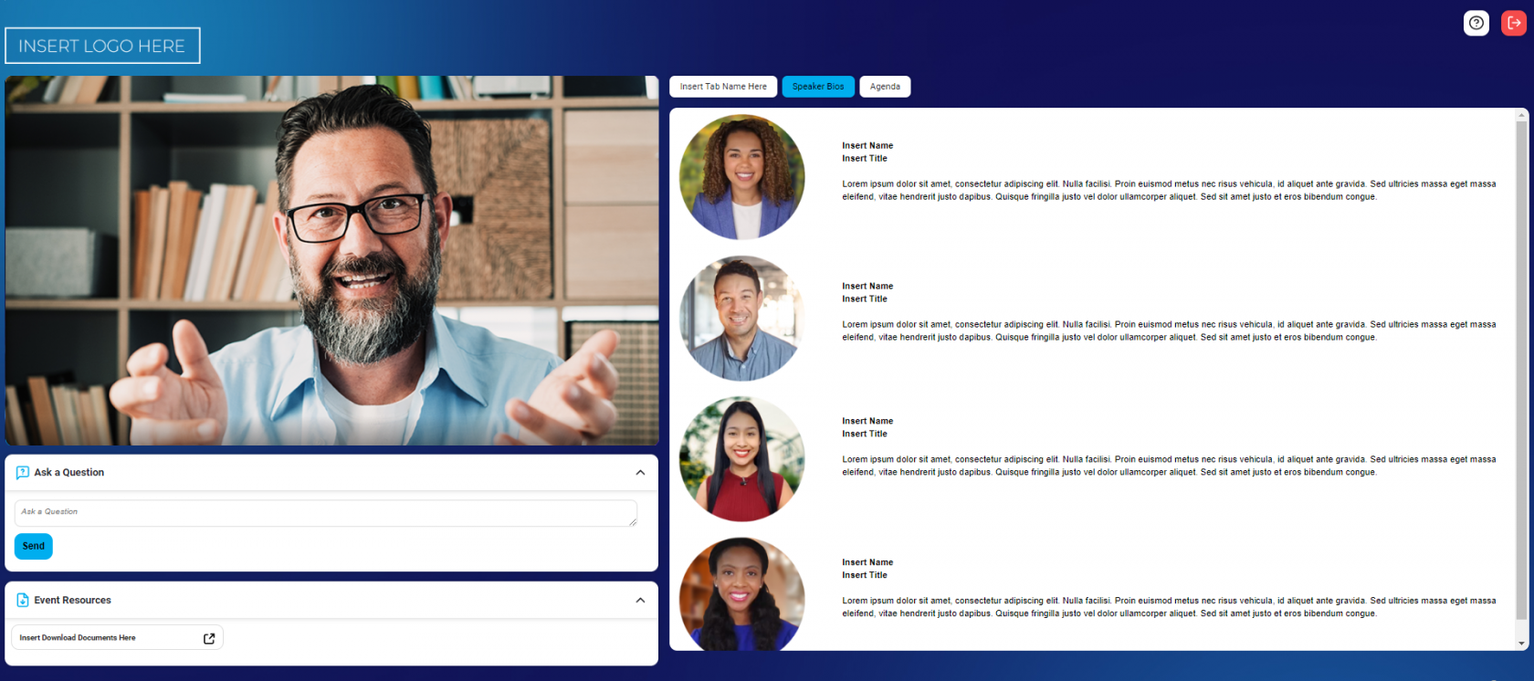
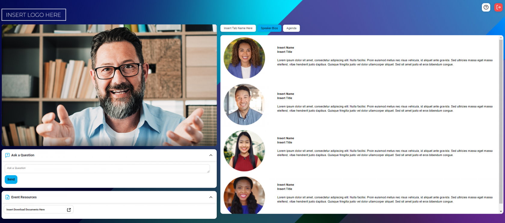
When upgrading to the latest design, it is a great time to revisit your branding elements. To make this new design look its best, we recommend a bright or dark background color, gradient, or image and a highlight color dark enough for white text to show up, such as the system default blue.
Here are some examples of how different custom images can look as the background to this new design. You may supply any image of your choosing to use as your background image.
 |
 |
 |
 |
 |
 |
 |
 |
 |
 |
 |
 |
 |
 |
For more information about branding your event, please see:
Event Branding & Customization | Event player container and window backgrounds